Project 1
Metallic depth typeface from Project Zero source inputs, focused on hinge joints, constrained movement, and dimensional letter construction.
Studio reference: Use this as the public texture/noise reference for the metallic surface treatment.
 Reference image 4591
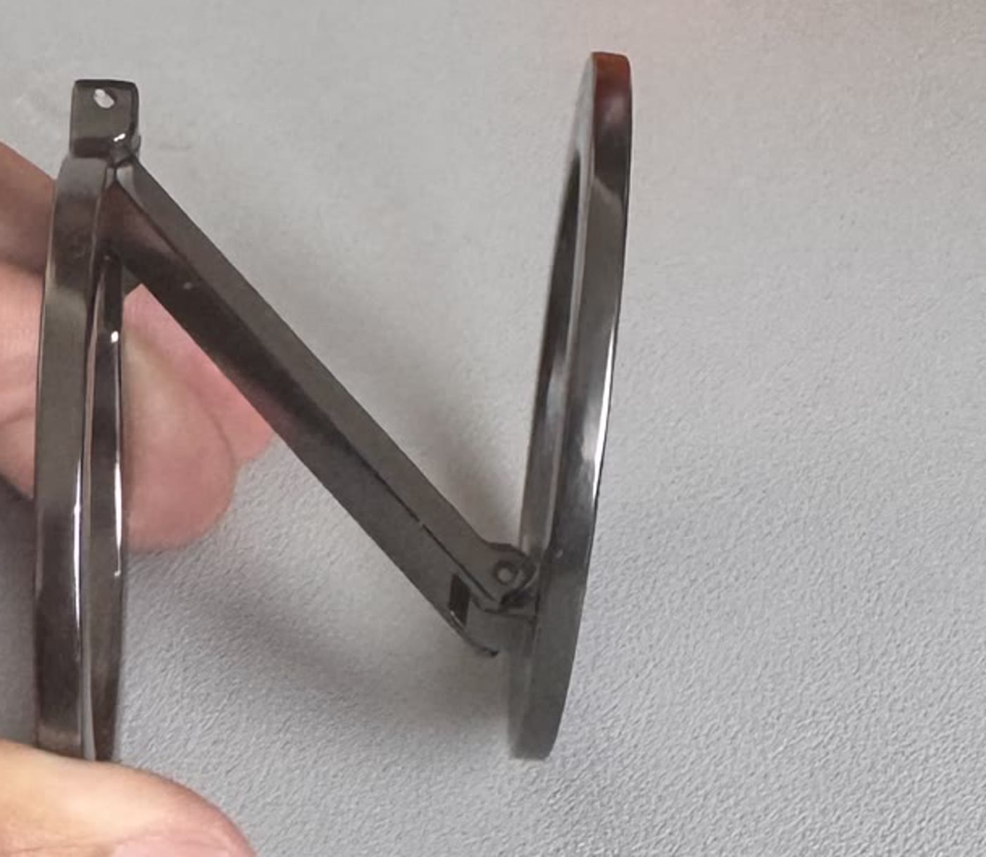
Mandip: yes the N is backwards, fix this
Mandip: the N is back to front
Mandip: The end is backwards. My photo was a lot clearer on the end, and what you've done is turned it like a mirror. It should be going from left to right, top to bottom for the middle part.
Studio Owner: Not every letter needs a circle. It is not a hard constraint. Only use circles where they make sense. In the uppercase N, the outer lines may be slightly rounded because the circles are invisible to the observer; keep the quirky middle line driven by the object movement constraint.